“Measure what matters.” That’s one of our favorite sayings at Maxio.
Sure, your teams may say they care about their OKRs, KPIs, etc, but if you don’t have the right tools to track those metrics and report on them regularly, you have no way of knowing if your day-to-day work is contributing to those goals.
For starters, it’s incredibly difficult to gather real business insights when your data lives in disparate systems. Without visibility into key metrics like churn rate, customer lifetime value, and user retention, it’s impossible to understand what’s driving growth.
This is why tracking your team’s data on a centralized SaaS dashboard is so important.
In this article, we’ll explore common challenges with gathering SaaS metrics and how purpose-built dashboards can help your teams provide real business impact. Let’s take a look.
What are SaaS dashboards?
A SaaS metrics dashboard is a visual display that centralizes subscription data and metrics for SaaS companies. Packaged in an easy-to-use interface, SaaS dashboards transform raw analytics into actionable business intelligence.
Rather than digging through spreadsheets, your executives can use these dashboards to visualize key SaaS metrics on demand through interactive charts and graphs. Some common dashboards provide insights into metrics like customer acquisition, account expansion, churn risk, recurring revenue forecasts, sales performance, and more.
For example, Maxio’s Days Sales Outstanding (DSO) dashboard helps Finance teams calculate DSO on a monthly, quarterly, or annual basis to supplement the way they build their financial forecasts.
By consolidating all your SaaS data into a customized dashboard, your teams can get visibility into what’s really driving business growth. Whether it’s improving your net revenue retention rate or reducing subscriber churn, SaaS analytics dashboards help make progress more transparent so you can course correct based on real data (versus gut instinct).
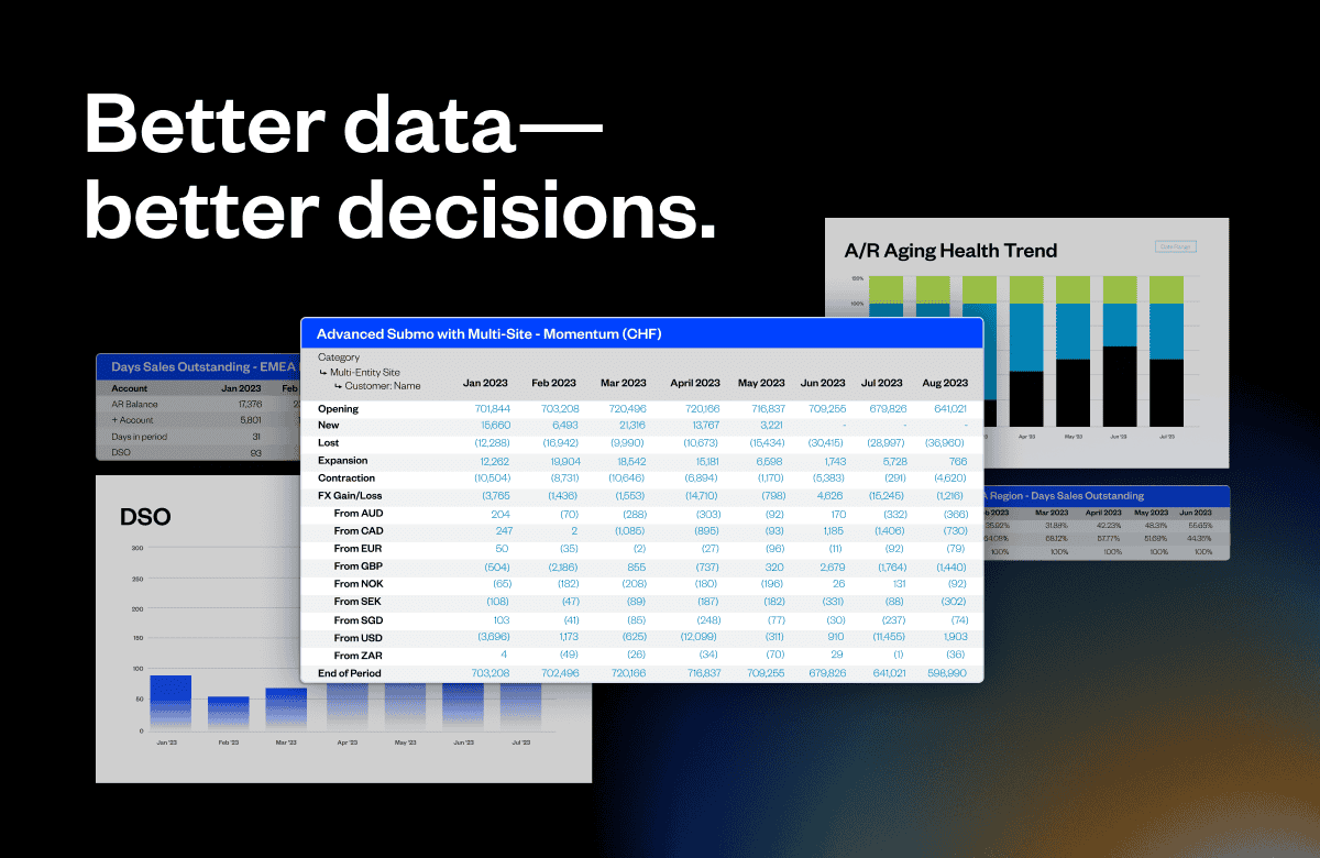
Benefits of using SaaS dashboards: Better data, better decisions
SaaS companies that adopt data dashboards position themselves for smarter decision-making and streamlined operations. Plain and simple. Let’s explore some of the top reasons SaaS businesses should invest in analytics dashboards.
1. Centralized access to critical SaaS metrics
Rather than compiling readings from disparate sources, SaaS dashboards enable users to monitor their most important metrics from a unified analytics tool. This single source of truth helps growth companies make better business decisions as they navigate the SaaS maturity curve.
Important metrics like subscriber growth, churn rate, and recurring revenue get updated automatically instead of through manual data entry. Visualizations transform complex metrics into intuitive charts on role-based dashboards. Your executives can also use these dashboards to gain visibility into the health and trajectory of subscription sales and account expansion initiatives.
Centralized data access also surfaces unexpected or hidden correlations through cross-metric analysis. For example, linking support ticket volume to account churn may reveal opportunities to improve retention through superior customer service. Without integrating SaaS datasets, these types of actionable insights will just get lost in the gaps.
In short, having all the pieces of the subscription sales and account management puzzle in a centralized dashboard clarifies which knobs you should be turning to drive business growth.
2. Greater visibility into business performance
SaaS dashboards dismantle the departmental data silos that restrict leadership’s view into core operations. By consolidating analytics into interactive, visual reports, your teams will gain transparency into performance across the organization—not just what’s happening in their department.
Stakeholders ranging from the sales team to the C-suite can review insights into revenue growth, customer engagement, and account health on their own time. Not to mention the customized views that most dashboards are capable of producing that ensure each user sees the most relevant key performance indicators (KPIs) for their role.
For example, the sales dashboard tracks new customer acquisition rates alongside the net promoter score (NPS) from customer success. If NPS declines among recent cohorts, leadership can correlate sales practices to churn predictors and coach sales reps accordingly. Or, the finance dashboard reporting on profitability margins can help your sales team right-size pricing and identify expansion opportunities.
3. Deeper understanding of business needs
SaaS analytics dashboards deliver more than static snapshots of your subscription data—they also give teams a much deeper understanding of the overall health of a business.
Rather than deciphering abstract figures on a spreadsheet, stakeholders can generate custom dashboards showcasing the key performance indicators that are most relevant to them. Your team members can then use these interactive interfaces to take the SaaS metrics that are most relevant to their department and turn them into easy-to-understand visuals.
For example, an executive may notice churn creeping upward on their KPI dashboard. With just one click on that churn metric, they can filter the dashboard view to the customer segments that are driving churn.
The ability to drill down into your business’s most important metrics ultimately helps eliminate any gaps that may exist between your data and strategic decision-makers. And while you don’t have to be checking your metrics 24/7, SaaS companies that leverage these dashboards will always have a better pulse on subscription performance than their competitors.
4. More user-friendly than spreadsheets
While spreadsheets are fine for storing subscription data, SaaS dashboards ultimately transform your metrics into intuitive visualizations that your teams can easily refer back to. Charts, graphs, and gauges allow users across different skill levels to digest insights quicker as well.
Fortunately, it’s not too difficult to implement some simple dashboard design principles to make your dashboards more readable. And you don’t have to be an expert designer either. Many popular SaaS dashboard tools come pre-built with clean layouts, thoughtful color coding, and whitespace that helps users focus on what matters most.
On the other hand, spreadsheets often require manual number crunching and formula building to derive meaning. And once you’ve done all that, there’s no guarantee that they’ll be easy to read. Dashboards, meanwhile, take care of the heavy lifting behind the scenes so users can spend most of their time acting on insights instead of processing data and trying to build out reports.
What SaaS metrics and KPIs belong on your dashboard?
With endless data available, determining the most crucial SaaS KPIs to monitor can be challenging—but not if you have the right SaaS reporting tools. Once you’ve chosen an analytics platform to build your dashboard with, you just need to come up with a few key performance indicators (KPIs) that your team members can rally around.
Throughout this section, we’ll cover the essential SaaS subscription metrics across customer acquisition, account expansion, and retention that you should be tracking on your teams’ dashboards.
Here are the SaaS KPIs you should consider tracking:
MRR and ARR
Monthly recurring revenue (MRR) and annual recurring revenue (ARR) are crucial SaaS metrics that quantify predictable revenue streams. MRR allows companies to monitor subscription performance month-over-month. Meanwhile, ARR projects future revenue based on the current subscriber base over the next 12 months. Tracking MRR and ARR over time provides visibility into growth and retention trends. Both metrics spotlight the overall health of the recurring revenue engine that sustains SaaS businesses.
Customer acquisition cost (CAC)
Customer Acquisition Cost (CAC) measures the average cost to acquire a new paying customer. By factoring sales and marketing expenses required to generate new business against net new customers, CAC spotlights spending efficiency. Monitoring CAC ensures customer growth remains profitable over the long term. No revenue metric on a SaaS dashboard offers more useful insights than keeping tabs on CAC to optimize and forecast budget needs per company growth objectives.
Customer lifetime value (LTV)
Customer Lifetime Value (LTV) represents the average revenue generated by a customer throughout the entire lifespan of their relationship with the SaaS company. Comparing LTV or CLTV to CAC helps determine overall business profitability. Monitoring LTV also assists with budgeting for customer acquisition and gauging whether accounts warrant additional investment for retention or expansion. Given its role in quantifying long-term subscriber value and sustainability, LTV deserves a top spot on any analytics dashboard.
Average revenue per user (ARPU)
Average Revenue Per User (ARPU) quantifies net revenue driven by the average customer account over time. An increase in ARPU signals successful upsells or add-on purchases. Meanwhile, declining ARPU could reflect lagging feature adoption or reveal an opportunity for optimized packaging and pricing strategies per customer segment. Monitoring ARPU benchmarks whether existing accounts expand meaningfully amid efforts to grow the customer base.
Customer churn
Customer churn represents the percentage of customers that discontinue subscriptions over a given timeframe. Because acquiring new customers costs more than retaining existing ones, managing churn is critical. Churn dashboards monitor cancellation trends, identify at-risk accounts, and inform retention programs. No metric better indicates growth troubles and renewal optimization opportunities than sudden or excessive customer churn.
Customer retention
Customer retention measures the percentage of subscription customers that continue service during a given timeframe. Retention ratios demonstrate the stickiness of a SaaS product suite and inform budget planning. Tracking retention over the lifetime of a customer cohort also spotlights opportunities to improve long-term engagement through initiatives like customer success programs or loyalty incentives. Much like churn, monitoring retention rate trends forms a health check on the most profitable growth lever – expanding within existing accounts.
SaaS dashboard examples
There are hundreds of software-as-a-service dashboards used at companies every day to track everything from product launches to marketing campaigns to employee headcount. In other words, if you can collect data around a business function, chances are you can visualize that data on a dashboard.
Here are some SaaS dashboard examples across sales, marketing, and finance that you can use as a reference.
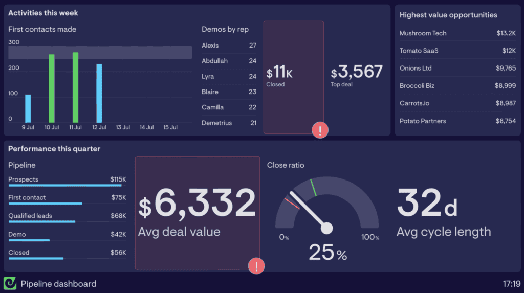
Sales dashboard: Geckoboard example
A Sales dashboard offers insights into customer acquisition and pipeline performance to inform staffing, activities, and tools for driving growth. Tracking key metrics like lead generation, sales cycle analysis, conversion rates, and rep-based trends helps keep the focus on strategic priorities.
These dashboards also help identify potential coaching opportunities to assist sales teams in meeting their revenue goals. With an analytical lens on sales operations via customized dashboards, SaaS leadership can foster data-driven decision making for sustainable business growth.
As an example, here’s a sales pipeline dashboard from Geckoboard. Using a dashboard like the one shown here, Sales teams would be able to view their quarterly performance, average deal value, sales cycle lengths, highest value opportunities, and more all in one place.
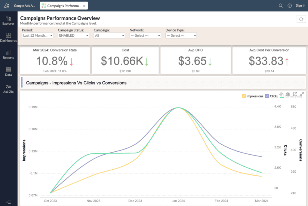
Marketing dashboard: Zoho example
A Marketing dashboard delivers visibility into campaign performance, lead generation, pipeline velocity, and the return on marketing investment. Monitoring these metrics enables data-driven decisions on budget allocation, channel mix, creative assets, and content strategy.
Marketing dashboards also quantify the impact of specific programs on acquisition and retention. By linking campaign analytics to sales outcomes, teams can optimize activities for the highest yield at the lowest cost.
This Google Ads analytics dashboard from Zoho is a great example of the insights busy marketing teams can plug into one place. Within this specialized dashboard, performance marketers can study their ad conversion rates, average cost per click, and compare ad performance over a five-month period.
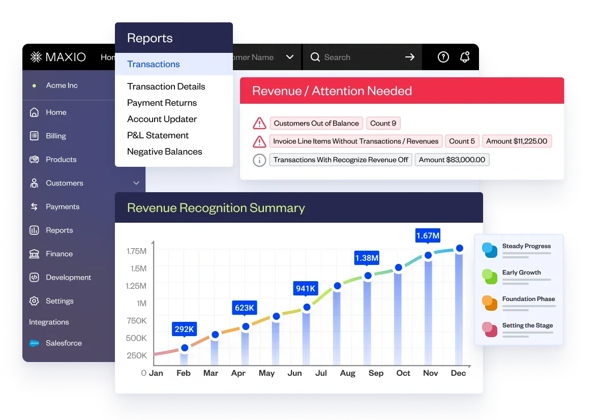
SaaS metrics and analytics dashboard: Maxio example
SaaS analytics platforms like Maxio consolidates key subscription data into customizable dashboards for comprehensive business visibility.
Maxio’s centralized interface tracks revenue metrics like MRR and ARR in real time while monitoring customer health via churn, retention, and engagement scores. These financial views also assist with cash flow, billing analytics, and financial planning activities.
With an out-of-the-box dashboard aligning to common SaaS KPIs, platforms like Maxio allow companies to focus on improving their SaaS product, user experience, and making better business decisions instead of report building.
Why not use a spreadsheet instead?
While spreadsheets like Excel provide basic data tracking, they fail to deliver the automation, integrations, and customization that a growing SaaS business needs to stay agile.
For high-growth startups, spreadsheet templates quickly become inadequate when you factor in the rapid pace of growth, vertical shifts, and financial ups and downs that are common with these types of businesses.
Spreadsheets are also notoriously difficult to collaborate inside of. Dashboards, however, centralize important insights by pulling data from many different integrated data sources. This way your team doesn’t have to assign spreadsheet management and maintenance to one person.
And finally, spreadsheets just weren’t built to turn your business’s KPIs into meaningful data visualizations. At the end of the day, choosing to upgrade to a SaaS dashboard will give your entire team an intuitive visual interface to uncover data patterns, track performance trends, and ultimately make better business decisions.
Using Maxio to monitor your SaaS metrics and analytics
So there you have it. Now you know the metrics you should be tracking, what makes central SaaS dashboards a must-have tool across teams, and you even have a few examples of dashboards to reference.
Now, all you need is a platform to help you build these dashboards to use across your own organization. This is exactly why we built Maxio. Our platform helps SaaS businesses master core metrics around customer acquisition, account expansion, billing, finance, and more.
Want to start making better decisions about the future of your business? Schedule a demo with our team to get started.